Mark Making and Printing – Experiment and design your own work

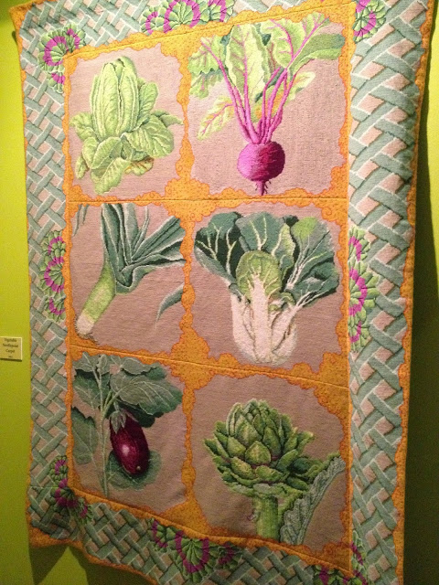
I knew very little about mark making and its importance before starting this embroidery course. Anything that involves paint and making a mess has to be good in my books!

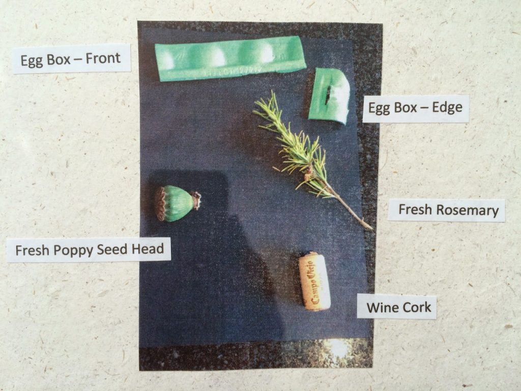
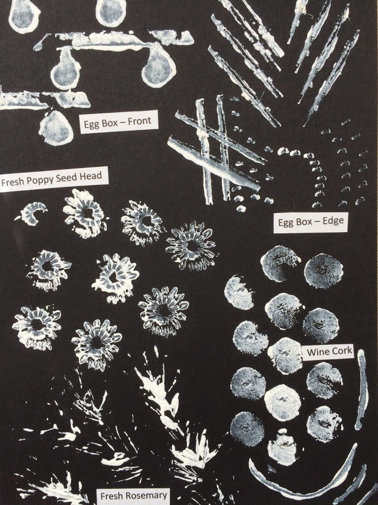
I will share with you what I have discovered. Mark making can be achieved with anything that leaves a mark or impression on a surface – eg. paint or pen on paper, drawing in the sand at the beach, or even playing with string as it falls its own way onto a flat surface. The original ‘mark’ created is an original form of source work perfect for a future design.These are some designs made using bits and bobs I found in my kitchen. I found it very effective using white paint onto black paper. Also I liked using black and white rather than specific colours because I found they created a neutral, unbiased design.
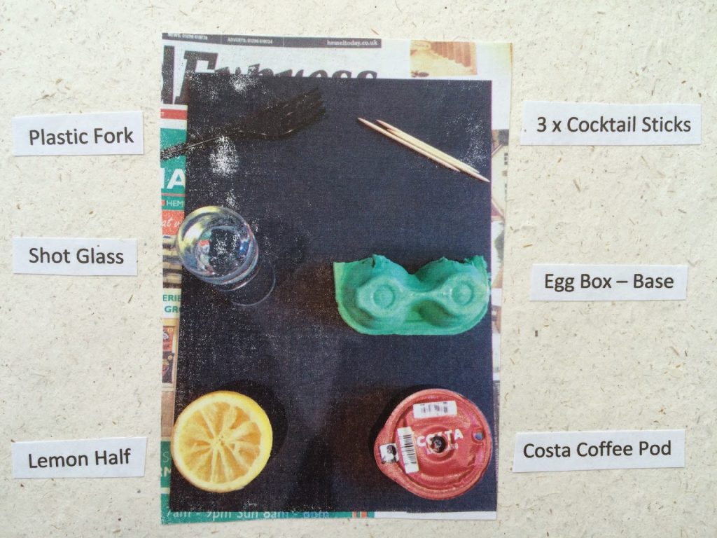
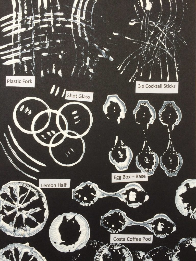
Design sheet 1:


Design sheet 2:


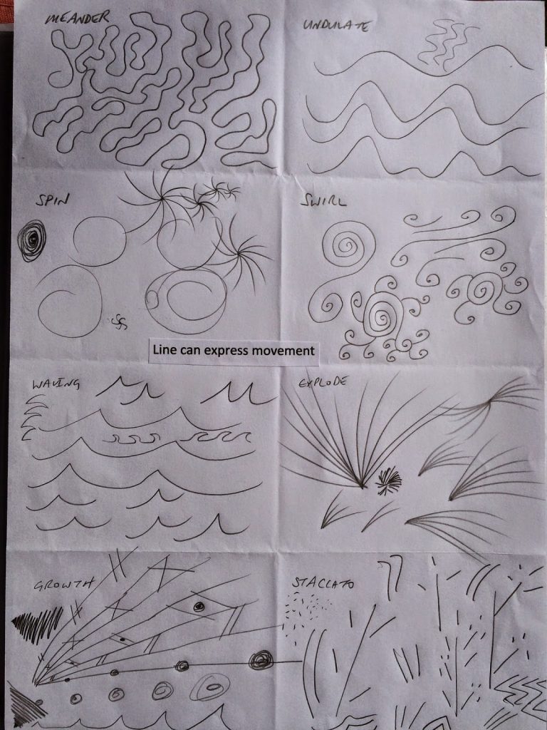
These are a selection of marks evoking movement and emotion.


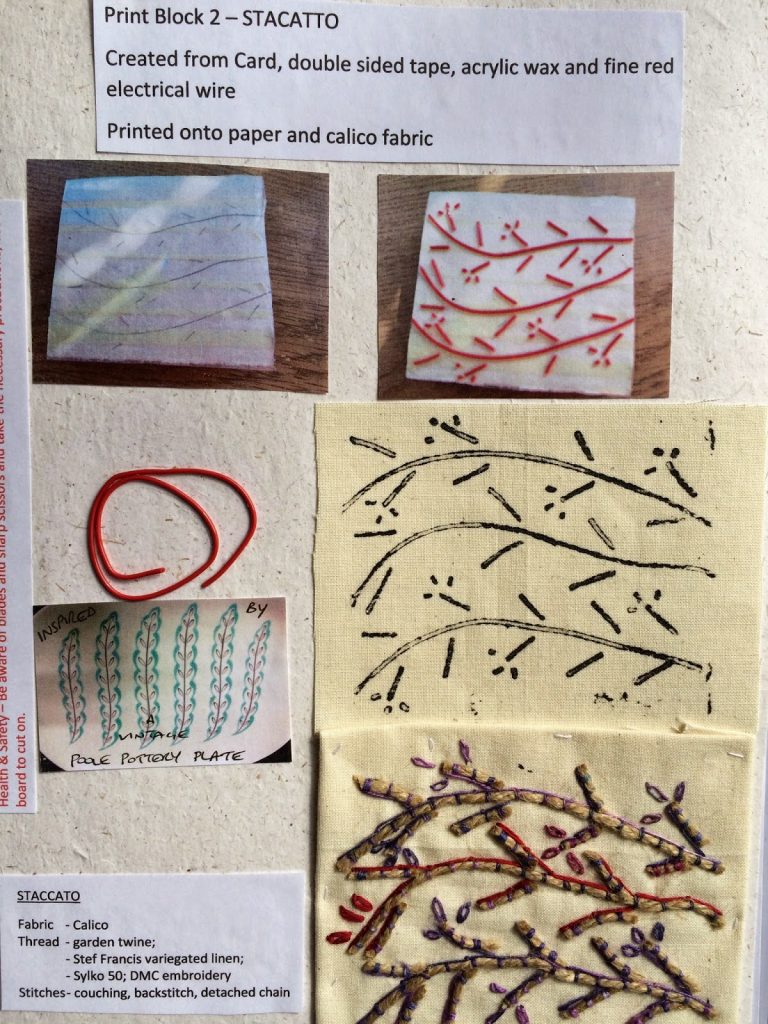
The Staccato design was developed further into a homemade stamp that was then embroidered.


The one thing I have discovered is that anything goes, and that all designs – especially the ‘mistakes’ are useful. I keep mine in a pile and sift through them occasionally when I need some ideas – it may only be a small section of an image that fits the bill. Have a go yourself!

Colour theory using a colour wheel – make one yourself!

Before starting my embroidery course I had very little experience of using a colour wheel. The style of work I create is mainly self taught and I have become accustomed to using my own instincts when it comes to mixing and matching colour. If it feels ok then I used it.
One thing I hadn’t accounted for was my own colour tastes. There are selections of colours that I always gravitated towards – colours I feel comfortable with – colours that have influenced my work.


I would like to share with you what I have gleaned from making my own colour wheel.
A colour wheel can be made of anything you like – paint, crayons, paint charts from the DIY store or even clipping from magazines. I made mine from paint.
What ever you chose, ensure the colours are of the same tonal value or shade.  Red, blue and yellow are the primary colours which are mixed in equal quantities to make the secondary colours; ie red and yellow to make orange. I used my Sizzix Big Shot and a Tag die to cut out the tag shapes.
It wasn’t until I made this wheel that the fear about the ‘unknown knowledge behind a colour wheel’ became clear. Complimentary colours appear as opposites on the wheel, and by mixing white or black with a colour you change its tonal value. To expand your knowledge, there are other things you can look into, for instance triad, tetrad or split complimentary colours, but I will leave this for you to seek out on your own.

The next thing to look at is how the primary colour hues work with each other, this is red, blue and yellow all in the same tone; which might explain why some embroidery and fabric combinations work better than others; ie working with blue thread on a red fabric will not have the same clarity or impact that a blue thread has when worked on yellow fabric. I have always ‘auditioned’ thread with fabric to see if it works for me. The primary hue theory explains why some of my initial choices have required changing for threads with more clarity.

Finally,  an exercise which was rather enlightening.
I started a small box of magazine clippings, collecting colours I liked which I made into a collage.
I collected these pieces of colour over a period of three weeks and was quite astounded at what I ended up with – a definite slant in my colour choice.

I hope you have enjoyed this post and hope you have a go yourself.

Kaffe Fassett Exhibition 2014 at the American Museum, Bath

The colourful collections of Kaffe Fassett have been on exhibition at the American Museum in Bath all summer, in a detached building set away from the main museum at Claverton Manor.
When I visited in early autumn, the building was partly hidden behind a large tree covered in textile ‘lanterns’ and shrouded in mist. It was a mystical treasure waiting to be discovered.
Entering the building I felt an immediate assault on my senses of COLOUR!
The main theme running through the entire exhibition was colour, colour and more colour detailing the knitting, needlework and patchwork of Kaffe. His mind must be in a constant whirlwind of colour.
Although I found his large pieces stunning and the level of stitch and design involved in their creation fascinating, some of my favourite pieces were his mood board displays, detailing his journey of ideas, from initial inspiration through to the final designs and collections.
Here are some of the photos from the day.